Animating Strava Data
Animated Running Data
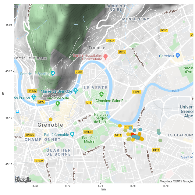
As a side project, I wrote some code to automatically pull my data from the Strava API and visualize it with some cool R packages. I documented the code on GitHub so that anyone can do this with their own Strava data.
Each slug represents an individual run, with red ones being more recent. The script will automatically pull in new runs, so the idea is that this might motivate me to go on more runs and flesh out the map.
